

Every document, all at once
A great idea
that wasn’t working
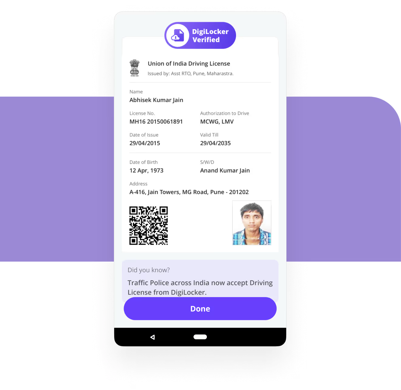
Digilocker was a massive step towards India’s paperless governance. The platform enables millions to issue and verify government documents & certificates digitally, thus eliminating the use of physical documents.
As great as the idea was, enough people were still not using it pertaining to high drop-offs and uninstall rates.
What was the
problem?
Before we got to work on overhauling the app flow and interface, we had to identify the problem.
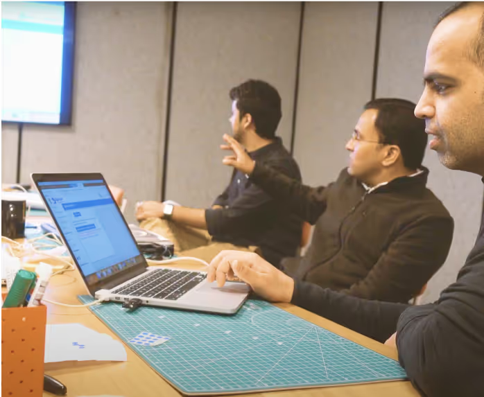
We ran a Design sprint with the Digilocker team, which started with identifying the issues and framing the critical problem statements for the team to work on.


Users didn’t really understand
what Digilocker was
People were confusing Digilocker for a drive where they could upload documents.
This was causing a major trust problem because user-uploaded documents were not considered valid for official purposes and were rejected by government officials when presented by the users.
Moreover, users were misusing the drive space provided to upload images, music and movies.

Massive user dropoffs
during the onboarding
The drop-offs during the onboarding process were a high 60% and we identified the confusing onboarding process as the primary reason for it. There were two ways for the user to onboard:
Using Aadhaar: Validating using Aadhaar number was the only way to access documents because we needed a robust identity verification before letting users fetch all the documents.
Using Mobile: This allowed the users to set up the app without verifying their Aadhaar, but they could not access documents which caused all the confusion.

Usage was restricted to identification documents
The idea behind Digilocker was to minimise the usage of physical documents by making it a place for people to access all official documents. However, due to lack of awareness, users were using it just to download their identification documents like Aadhaar and driving license.

serving all the documents on a platter
We revamped the home screen to serve the users categorically with different types of documents they could access though Digilocker and even added the samples to what these documents would look like.
As a result, the average documents fetched per user went from
2.7 to 3.4 in just a matter of weeks.

How much difference did all the changes make?
280% increase
in 30- day user retention (18% to 68%)
66% Aadhaar verified
up from 54%
“You’ve helped a govt team in “not only catching the fish, but also teaching them to catch fish themselves in the future.”
Watch us in action
Reimagining Product Experience with Digilocker: A Design Sprint Case Study


