In a world of swiping through reels at an alarmingly fast speed, our attention span is shorter than ever. This impatience translates directly to the digital world, where users form impressions of apps and websites in a flash. Think of it as the 7-second visual merchandising theory, which states that it takes 7 seconds for customers to make the first critical decision about your product. Years of product design, development, and marketing often come down to a mere 7 seconds.

And it's not just about the logo! In that fleeting glimpse, users might recognize a screenshot from highly popular brands like - CRED, Swiggy, or Zomato based on their overall design language – clear hierarchy, distinct color palettes, and well-placed imagery.
I saw this first hand while discovering & designing Savage - a fitness-tracking app for Indian women, customized based on their preferences, skills, goals, habits, and other health parameters to give them the right nudges at the right time.
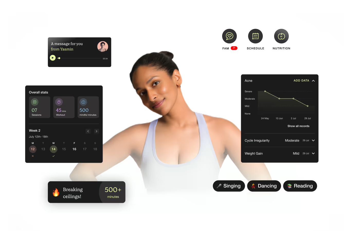
When Savage approached Parallel, their goal was to design a fitness app that feels inclusive and relevant for women all over India.
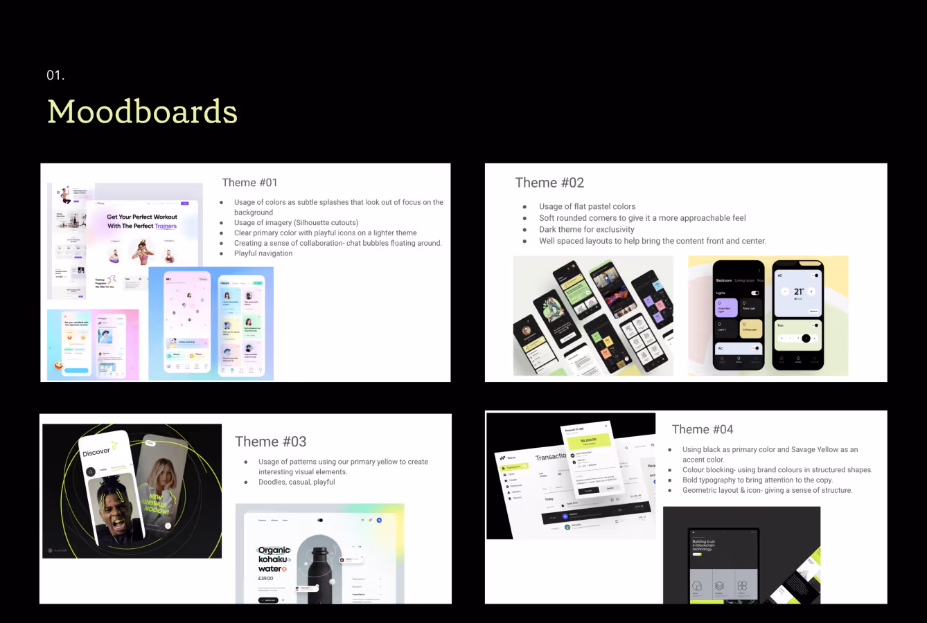
Designing a product is a dynamic process. Through multiple iterations, we strive to deliver effective experiences that delight users. While they had a brand book and their colors sorted, we dived further into the kind of visual language they could have—especially looking at their name, “Savage!”—and got stuck with the famous decision of whether to go for a sleek, dark background or stick to a lighter palette. While one founder found the darker version nicer, another simply said they preferred the lighter one.
To avoid a biased, subjective veto (or any locked horns) and to keep in mind the tight timeline, we wanted to answer the question we always fuss about: What would the user prefer?

What is the 5-second test?
5-second testing is a user research method that helps you gauge your users' first impressions of a design. Usually, a 5-second user test involves showing the prototypes to the users and asking follow-up questions. We chose the 5-second Attitudinal approach for our case since we focused on understanding the feeling behind the visuals.
People make decisions based on emotions as much as logic. In 5 seconds, users can only absorb a bit of complex information. Focusing on feeling taps into that emotional response within the first 5 seconds. It allows a quicker, more intuitive understanding of the product's essence. We did this by ideating keywords that captured the essence of Savage.
Step 1 - Finalizing Brand Keywords
We started by looking at similar brands and collecting moods or keywords not entirely defined for Savage yet. I decided to start by collaborating with the Savage team on keyword development. This included defining all the keywords and synonymous words that captured the feelings users would feel after using the app.
Does the product feel Exciting or Peaceful? Exclusive or familiar?Bright or light-hearted?
Step 2 - Recruiting Users
While conducting the tests, our second step was to recruit users who fell in the category of our target audience. We carefully selected working women going through PCOS, for whom non-contextual training and gyms didn’t work, with little to no context of what Savage does.
Step 3 - Running the Tests
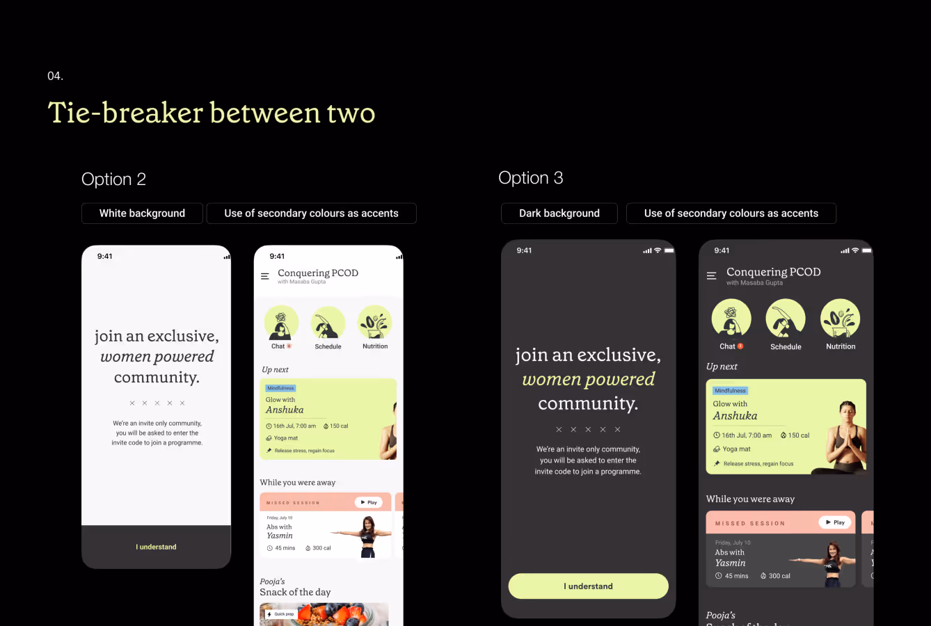
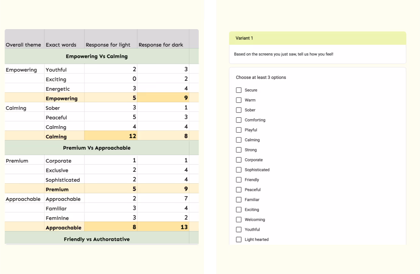
To keep the evaluation more objective, we transitioned from open-ended questions to a structured selection format on a Google Form. This kept things clean and data-driven. We also ensured that 50% of our participants were shown the light palette first and the other half the darker one to avoid biases and get fair responses. I then showed them Design A for 5 seconds and gave them a list of words to pick from - based on how they felt. Next, they were presented with Design B, followed by the same list of words but jumbled.
Step 4 - Analysis
I remember a user commenting that the lighter palette made them feel peaceful because it was a break from the other dark apps. Another one mentioned how the darker version made them feel powerful. During our analysis, we found out that the brand was inclining towards being more approachable, friendly, and bold overall. While the Pale white version was perceived to be more calming and peaceful, the darker version was perceived as more empowering and energetic.

Now this was a better way for both the founders to finalize on a brand language - do they want their users to feel Calm or Energetic?
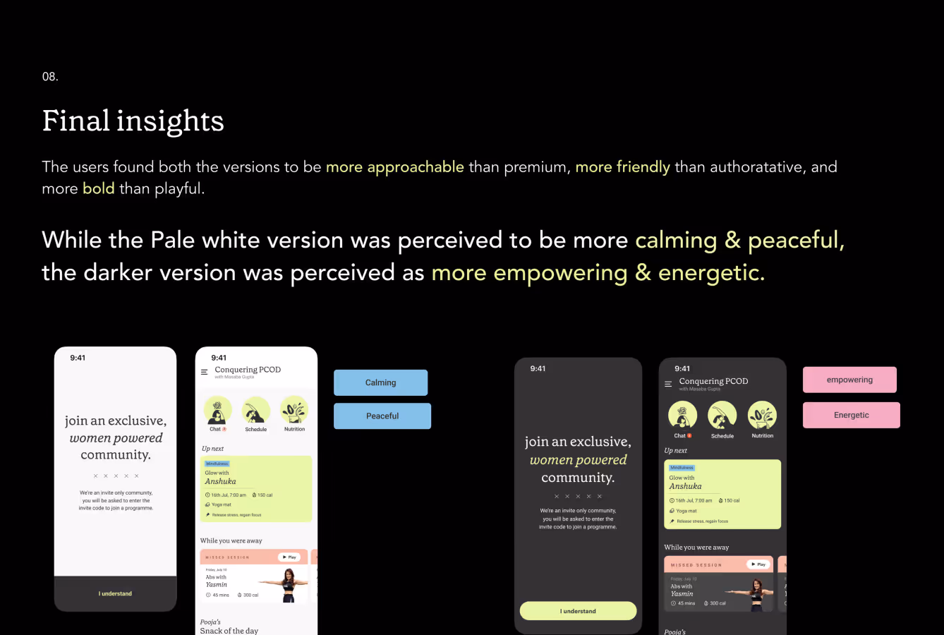
They wanted them to feel Energetic, and we went ahead with the darker version.
What are my unique learnings from the 5-second test?
Environmental Influence
Throughout the analysis, I discovered a fascinating phenomenon—how the user's environment directly impacted their perception of the app. This analysis made me curious: Could this perception be influenced by the visual languages of other brands users encounter daily, like Spotify, CultFit, and CRED? It seems user perception goes beyond just a brand's voice; it culminates all their app experiences.
The Power of Visual Storytelling
Today's branding extends far beyond a catchy logo or social media presence. It's about how a brand translates its identity into the very fabric of its product design. This is where visual language shines. We can instantly recognize screenshots from Swiggy or Zomato, even without their logos. This is the power of a strong, consistent visual language transcending mere logos.

check out these related blogs


.webp)