Fintech UI/UX Design: Strategy for 2026 Growth & Adoption
Build trust through design. Learn the 2026 best practices for Fintech UI/UX design to simplify complex financial data, reduce friction, and increase user retention.
Massimo Vignelli, a popular Italian designer once said, “Good design is a language”— A language to not just communicate with your customers but also a language to know their needs. And perhaps, a language which all “future financial products'' will want to speak in and that’s exactly where the role of creating great fintech UI/UX designs come to play.
Believe it or not, an underperforming application or website can cost you not only your money, but your customers as well!
It is 2021 and online platforms are the new commercial centres—from shopping malls to financial establishments, businesses are redefining credibility and reliability.
Just the way customers will never enter an “under construction” shopping mall, online visitors will steer clear from poorly-designed, under-structured websites and apps. This holds especially true for fintech products since it involves money and sensitive information.
A delightful and user-friendly financial service design is the ultimate way to make people fall in love with a product, and that’s why we have decided to share some useful insights on fintech UI/UX designs to prove that financial products can be easy-to-use, beautiful, and yet perpetuate the complete functionality required to meet users' needs while being legally compliant to the regulations.
When we say fintech product design, don’t be confused with the conventional concept of design (which focuses on aesthetics).
Fintech UX Design is more about science—focusing on data, user behaviour, design patterns, and creating products that will solve customer’s pain points.
Now creating a great fintech design experience is a difficult road, given the industry’s traditional foundation and the scale financial institutions operate.
Disrupting the age-old paradigms and merging them with new technical edges is a challenging task. However, product owners have no choice but to focus on the user experience to improve engagement and interaction.
Having said that, let’s begin with what fintech UX design is and why is it so important, followed by understanding the challenges designers face while creating a fintech UX design.
What is fintech UX design?
Fintech UX signifies specialised skills, patterns, guidelines, and ideas to create better digital experience for financial services, financial products like insurance, banking, payments, lending, and much more.
The idea is to create user-friendly and intuitive experiences for:
- End customers of the financial institutions, and
- Enterprise software used by the employees within the financial organisations

Why is Fintech user experience so important?
Ever wondered what makes a great financial product? Is it the number of functionalities and features it has? Or creating something simple, innovative that helps get the job done faster and yet is in sync with the latest design trends.
While innovations enriched with design trends and functionality are features that help financial services enhance their position and brand image, at its core, a product becomes special when you put the maximum focus on the USER.
It doesn’t matter how advanced a financial product is or how creative the design interface is, the primary element will be still missing if it isn’t created by keeping the human psychology in mind.
In the end, a good fintech user experience is all about, the USER.
To understand why fintech UX design is so important, let us try to understand how it helps your customers in the first place.
Signing up and onboarding:
Since this is the first ever interaction that visitors and potential customers have with a site or app, having a great user experience in place can set the tone immediately and persuade them to sign up for your services.
Trust factor:
Financial services require customers to share their sensitive information. Good fintech UI design can help build that trust experience and ensure that the process of information exchange is easy and safe. Having a badly designed product will drive the customers away who are in need of your services but don’t trust your presentation enough to sign up.
Staying on the move:
Smartphones have gone through a huge transition in our lives—from being merely used for calls to now removing the need for wallets, documents, cheque books, and more. People are spending a lot of time and evening working on their phones, which calls for a robust fintech UX design to carry their financial needs without any hassle. A seamless product, devoid of any friction, adds to the customer experience and improves customer retention as well as engagement.
Increased transparency:
Gone are the days when you had the need to study law to understand financial products and the clauses. Good fintech user experience reduces complexity and information overload, bringing simplicity, transparency, and thereby, trust.
Simplified site/app navigation:
Your customers want solutions to their problems and they want them now. Good fintech app UI prioritises site navigation and empowers your customers to get their job done with little effort and fewer clicks or taps.
5 challenges people face while creating fintech UX designs
For most individuals, finance isn’t an exciting topic and it is one of the precipitous hurdles, which businesses should solve for while creating a finance website or an app.
Despite this, many fintech products don't care about it and their solutions tend to focus more on adding bells and whistles rather than focusing on users and their needs.
Challenge #1: Don’t bore the customers
Problem: There’s no denying that financial products tend to be boring and the real challenge for any designer is to create something that could deal with this boredom.
Solution: Rather than creating fintech UI designs that are bland and boring, try to make them fun and joyful. Nothing boosts confidence and motivation like products with a clean design, smooth flow, and positive reinforcement at the right places. It’s all about counteracting boredom by bringing excitement to help users create a bright financial future.
Quick tips:
- Add fun elements to evoke excitement
- Keep the flow clean, subtle, and smooth
- Focus more on the user’s goals to keep it engaging
- Keep the colours minimal and pleasant
- Maintain consistency in the designs
.gif)
Challenge #2: Don’t overload the customers with information
Problem: When it comes to finance, things look great when they are less complicated. Displaying excess information not only is overwhelming for the users but also makes them less likely to use. Having too many features could be counterproductive. In fact, screens end up looking crammed with tons of information and increases the cognitive load for the user. These aspects directly impact the app’s usability.
Solution: “First impressions are important” and that’s so true in the case of fintech UX. Keep things simple and focus on making the on-boarding process great. Make sure your app doesn't have a steep learning curve. Keep the ‘information architecture’ contextual. This might help make things personal and act as a bridge for the customers to navigate through the fintech product's features.
Quick tips:
- Make the on-boarding process simple and fast
- Avoid adding too much information
- Give a personal touch by keeping the information architecture contextual
- Focus more on the journey - help the users navigate through the features easily

Challenge #3: Don’t burden with too many features
Problem: Checking your bank balance anytime anywhere, making transfers, tracking your investments, paying your bills and all the way to booking flight tickets are just a few examples of what one could do with finance apps. Though this could be a great thing, it could also turn out to be a nightmare for both UX designers and users.
Overloading a fintech product design with too many features (often called Feature creep) is a major design challenge and it isn’t confined to banking alone. Beginning with a profitable yet logical approach, many businesses try addressing all probable needs to create their “perfect” app. Eventually, it ends up becoming a software with ‘feature overload’ but doesn't become a product that users love.
What’s worse is the ‘features overload’ makes the app look complicated and messy, leaving the users confused. With more notifications and more nudges, it makes things hard to deal with—something as important as finances with clarity. This provokes more confusion and stress to the users, which results in a bad user experience.
Solution: Say “NO” to unnecessary features. Think 360° from a user’s perspective. Find relevant moments to display specific features because there isn’t any need to show everything at once. Utilise information architecture smartly and as a tactic approach to systematise and show your features.
Quick tips:
- Involve your target audience in your product design process
- Perform in-depth user research and user testing
- Focus on UX Writing to simplify complicated terms and jargons
- Ensure your UX Writing helps bring clarity, consistency, and excitement
- Provide in-context guidance to bring clarity at the right moment

Challenge #4: Keep the financial language simple
Problem: Another crucial challenge with any fintech UX design is its unfathomable language. Financial statements, profits, balance sheets, and cash flow are terms that most people hardly use on a day-to-day basis. Language is something a financial site or app cannot afford to overlook.
Solution: For a seamless experience, a financial product design should be understandable to both—newbies and experts. So create an appropriate termbase which will not overload the users with data. This process might be arduous for any UX team and not getting it right will leave a huge impact on the product’s adoption as well as retention levels.
Quick tips:
- Do not use jargons
- Avoid using complex terms
- Try your best to use layman terms
- Pay attention to the formatting standards
- Use terms that both newbies & experts can understand

Challenge #5: Provide clear call-to-actions to make better decisions
Problem: Most financial apps are designed to help customers improve their finances. Whether it's by investing their spare change, managing day-to-day purchases, or helping to create a powerful and diversified portfolio. Sometimes, they also help manage budgets, track spending, and improve the overall management of personal finances better. That's great, but what is often never focused is to help them improve their habits and break irrational behaviour patterns.
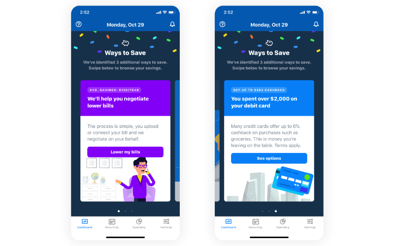
Solution: Good fintech UI design should not just nudge the users to make key decisions but must also amalgamate emotional feedback powered by data. Say, for instance, if a decision has helped the user save some money—notify that and appreciate them about it. This pat on the back makes them feel great and motivates them to keep going thereby increasing retention and engagement.
Quick tips:
- Motivate the users with right messaging at right time
- Notify them about their financial achievements
- Help users make informed financial decisions
- Help them build better financial habits

Ways fintech UI/UX design can improve engagement
The ultimate aim of a stellar fintech user experience is to improve product adoption as well as customer engagement.
Here are a few ways how fintech user experience design can help you raise your user demand.
Design journeys
People are tired of generic approaches and prefer something that matches their preferences. Customer journeys are a great way to track how your visitors are landing on your platform.
There are 5 key factors every designer should focus on with customer journeys:
- Awareness: How to get your brand’s word out?
- Consideration: Give them a reason to not say no!
- Purchase: They like what they see, and they “buy” it!
- Retention: Your customers are in here for a long haul.
- Advocacy: Are your customers creating a new pathway for new customers?
Mobile first
There is no point denying the importance of the mobile. In fact, mobile e-commerce sales hit a $2.92 trillion valuation in 2020, bringing forth the large user base of a smartphone. Having a mobile-friendly fintech UI/UX design attracts smartphone savvy traffic that create a separate line of engagement and furthers boost user demand.
Design thinking
Another feather is the customisation hat. Design thinking is one of the ways for personalising each platform, based on the consumer. This adds dynamism to the solution and flexibility to keep up with the fickle minded user!
Data visualisation
Now this is an interesting way to improve engagement among your users. Simply put, data visualisation presents the data in a simple visual manner that helps users understand their financial activities in a glance.
For instance, a pie-chart can represent credit, debit and savings, all in one image to help the user know about his/her spending activity and chart out saving oriented habits.
With predictive technology, applications can also determine patterns and help users plug the loop if any in their financial planning. This is especially prevalent in personal finance apps that are in boom as they are becoming the virtual financial assistance people never had!
Helping customers detect patterns and offer data backed evidence is a great way to improve user experience and therefore, generation as well.
Gamification
People are often wary of finances, let alone finance merged with technology. Gamification is a fun way of teaching users about stocks, investment, and savings to name a few. The perfect fintech user experience design in this case makes money matters less stressful while offering hands-on training with respect to the sectort. You can include points, bonuses, visual aids and a lot more to keep things interesting.
Centralised banking
Third party integrations can help make the app more holistic and offers users the ease to do a lot more than just view finances. This can include merging payments, insurance, deposits, and credits etc. together for an all-inclusive platform.
Self-service
The pandemic proved the need for fintech platforms to enable users to self-serve. This means that a customer complaint fintech platform will not only be streamlined but also allow users to execute most of the tasks with minimum or no intervention. This will help users engage directly with the app or website and thus improve engagement.
How to accommodate changing customer experiences
Customer expectations are never the same. With changing customer dynamics, it is important for founders and product managers to keep improving their fintech UI/UX designs on a regular basis.
Here’s how you can try rowing the boat:
Continuous product discovery
The main aim of "continuous product discovery" is to shift the research into a customer-centric process, where design teams work with customers or end users to co-create their products. It is a practice that involves both customer conversations and experimentation to inform better product development decisions.
This method not only minimises the risk of building ineffective solutions but also keeps your fintech UI/UX design relevant to your customers.
Use data to make ongoing improvements
Should designers rely on their guesses and intuitions? Definitely not! Why?
Gone are the days when design used to depend majorly on the designer's creativity and colour palettes. User experience works differently these days. Users' data, feedback, and behaviour are crucial components of a successful UX design. With advanced analytical tools in the market today, data is indeed the "new gold" that can help and guide designers to make better decisions.
Start the UX design after a proper data research in order to learn the how's and why’s of user behaviour. Visualise the data into segments, derive some regression models, and finally, come up with qualitative outcomes which are non-numerical—inclinations, feelings, and preferences.
Stay truly agile
Imagine finding yourself designing and building a product that nobody wanted? Imagine the amount of money and efforts going in vain? It's scary to even hear.
The answer to overcome this problem is Agile UX, a process that amalgamates Agile software development with the product & interaction design that the UX specialists create. It involves embedding one or more UX experts to the agile development team to understand and value the UX role. Now, this also means allotting budget and time for UX’s complete process, even including research and testing.
Don’t lose the pulse of what your customers want
The ui/ux space is infamous for half-hearted work. This usually stems from creating a product from the perspective of the company rather than the customers. Understanding customer essentials can help businesses stay up to date with the changing customer demands.
Preparing for the future of fintech UI/UX designing
Fintech user experience designing is subject to constant change, thanks to the introduction of new technologies that can alter digital financing permanently.
Blockchain:
Blockchain is not far away and can be a great inclusion for those who share accounts or financial activities on a both personal and professional level. If a user handles her account and also oversees her family members’ financials, fintech design supporting blockchain can easily shave away extra steps needed for identity, permission and access. Similarly, on a professional scale where large transactions are involved, fintech platforms that are able to accommodate blockchain will offer more transparency to the stakeholders without the multiple login and logout activities.
Financial inclusion:
This is all about the unbanking experience the ui design will be all inclusive and devoid of banking details since they will be specifically designed for the unbanked. It will be all about financial inclusivity!
Open banking:
Banking has always been a closed industry worldwide, monopolising most financial services. But today, digitalisation has brought new changes to this industry. Open banking is for sure creating a lot of buzz in the financial market. With Open Banking, UX design will become one of the main ways to not just comprehend customers but also to make sure that they will pick your financial service out of the many.
Big data management:
The existing data repository belonging to financial institutions continues to be unstructured but has the potential to identify future financial trends as well as risks. Fintech ui/ux designing will require accommodating this data extraction and offering insights into the market as we have risks to enable users to make informed financial decisions. We are at the onset of the process but have a long way to go before achieving fruition.
Privacy & security:
As time goes by, more and more users are raising questions about privacy. To be honest, privacy was never meant to be a trend but a permanent aspect of a fintech platform! Make your fintech apps or websites more human by prioritising privacy. For instance, notify them about data permission frequently and clarify what information used as well as when it will be used. You can also make it easier for them to trust you by giving them control over their own data.
Bonus: choosing the right fintech design agency
The role of a design agency is vital for any business looking to roll out a worthy product into the market. Since fintech UI/UX designing requires an extra layer of security along with aesthetics and functionality, choosing the right fintech design agency is not ‘nice to have’ but ‘must have’.
Here are few points to keep in mind while selecting your service provider:
Domain expertise
Financial institutions, small or big, all have one thing in common—the need for experts to master the information system so that they can take the right business decisions. Now, that’s also where a good UX comes to play. There is no denying the fact that UX for financial products completely differ from the traditional systems.
The primary challenge is to convert a complex multi-feature solution into an intuitive and user-friendly interface. An effective UX engineering isn’t just about designing attractive user interfaces. It should also focus on simplifying the pain points that end customers have.
All of these can be successfully achieved if the agency you’re choosing has the domain knowledge and the right UX expertise to explore the bigger picture of user scenarios, services workflow, and the user journey map.
Product thinking
Effective product thinking starts by recognising and jotting down the users’ problems. Then, a good strategy is set up, with objectives clearly being outlined by the designers. Product thinking is all about solving real problems of the users by creating meaningful solutions that add value.
A good agency with the right designers focuses more on Product Thinking. They leave no stone unturned to determine what users want and ways to fix their pain points.
Portfolio
A creative portfolio speaks volumes about an agency’s capability and adds to their credibility. While checking their portfolio, check for their value proposition followed by pretty designs as mere aesthetics do not guarantee user experience.
Methodology
Before you seal the deal, try understanding the methodology that your design agency follows. Is it research-oriented? Do they have a unique approach to problem solving or do they prefer to go for run-of-the-mill tactics? Are they really interested in knowing about your business? These are some of the questions that you can ask to determine whether your service provider is really invested to build a robust user experience for your fintech platform.
Do you talk to designers or sales folks?
This is a very important parameter to gauge the creativity and flexibility of a design agency. If sales people are the face of a particular organisation, you need to move on to a service provider where you are in direct touch with the designers to minimise any conflict in the end results.
The new fintech UX design trends and existing practices continue to revolutionise the way you track your finances, invest in stock, apply for loans and so much more! The future holds promising new events that will further simplify day today activities and help you execute your financial chores at the tap of a button!
The future is finally here!
When it comes to developing products for FinTech—be it digital banking, lending, online trading or e-wallets, the design of the product should be simple and easy to understand. It is this balance of design, explainability and usability that we strive to achieve at Parallel with all our products and especially for digital financial services.


.avif)


